Search in scripts for "Up down"
Narayan Candle Up/Down Indicator //@version=5
indicator("Candle Up/Down Indicator", overlay=true)
// Candle colors
candleColor = close > open ? color.green : close < open ? color.red : color.gray
// Plot candles as background
bgcolor(candleColor, transp=80)
// Optional: plot arrow on up/down
plotshape(close > open, title="Up Candle", location=location.belowbar, color=color.green, style=shape.triangleup, size=size.tiny)
plotshape(close < open, title="Down Candle", location=location.abovebar, color=color.red, style=shape.triangledown, size=size.tiny)

ATAI Volume Pressure Analyzer V 1.0 — Pure Up/DownATAI Volume Pressure Analyzer V 1.0 — Pure Up/Down
Overview
Volume is a foundational tool for understanding the supply–demand balance. Classic charts show only total volume and don’t tell us what portion came from buying (Up) versus selling (Down). The ATAI Volume Pressure Analyzer fills that gap. Built on Pine Script v6, it scans a lower timeframe to estimate Up/Down volume for each host‑timeframe candle, and presents “volume pressure” in a compact HUD table that’s comparable across symbols and timeframes.
1) Architecture & Global Settings
Global Period (P, bars)
A single global input P defines the computation window. All measures—host‑TF volume moving averages and the half‑window segment sums—use this length. Default: 55.
Timeframe Handling
The core of the indicator is estimating Up/Down volume using lower‑timeframe data. You can set a custom lower timeframe, or rely on auto‑selection:
◉ Second charts → 1S
◉ Intraday → 1 minute
◉ Daily → 5 minutes
◉ Otherwise → 60 minutes
Lower TFs give more precise estimates but shorter history; higher TFs approximate buy/sell splits but provide longer history. As a rule of thumb, scan thin symbols at 5–15m, and liquid symbols at 1m.
2) Up/Down Volume & Derived Series
The script uses TradingView’s library function tvta.requestUpAndDownVolume(lowerTf) to obtain three values:
◉ Up volume (buyers)
◉ Down volume (sellers)
◉ Delta (Up − Down)
From these we define:
◉ TF_buy = |Up volume|
◉ TF_sell = |Down volume|
◉ TF_tot = TF_buy + TF_sell
◉ TF_delta = TF_buy − TF_sell
A positive TF_delta indicates buyer dominance; a negative value indicates selling pressure. To smooth noise, simple moving averages of TF_buy and TF_sell are computed over P and used as baselines.
3) Key Performance Indicators (KPIs)
Half‑window segmentation
To track momentum shifts, the P‑bar window is split in half:
◉ C→B: the older half
◉ B→A: the newer half (toward the current bar)
For each half, the script sums buy, sell, and delta. Comparing the two halves reveals strengthening/weakening pressure. Example: if AtoB_delta < CtoB_delta, recent buying pressure has faded.
[ 4) HUD (Table) Display /i]
Colors & Appearance
Two main color inputs define the theme: a primary color and a negative color (used when Δ is negative). The panel background uses a translucent version of the primary color; borders use the solid primary color. Text defaults to the primary color and flips to the negative color when a block’s Δ is negative.
Layout
The HUD is a 4×5 table updated on the last bar of each candle:
◉ Row 1 (Meta): indicator name, P length, lower TF, host TF
◉ Row 2 (Host TF): current ↑Buy, ↓Sell, ΔDelta; plus Σ total and SMA(↑/↓)
◉ Row 3 (Segments): C→B and B→A blocks with ↑/↓/Δ
◉ Rows 4–5: reserved for advanced modules (Wings, α/β, OB/OS, Top
5) Advanced Modules
5.1 Wings
“Wings” visualize volume‑driven movement over C→B (left wing) and B→A (right wing) with top/bottom lines and a filled band. Slopes are ATR‑per‑bar normalized for cross‑symbol/TF comparability and converted to angles (degrees). Coloring mirrors HUD sign logic with a near‑zero threshold (default ~3°):
◉ Both lines rising → blue (bullish)
◉ Both falling → red (bearish)
◉ Mixed/near‑zero → gray
Left wing reflects the origin of the recent move; right wing reflects the current state.
5.2 α / β at Point B
We compute the oriented angle between the two wings at the midpoint B:
β is the bottom‑arc angle; α = 360° − β is the top‑arc angle.
◉ Large α (>180°) or small β (<180°) flags meaningful imbalance.
◉ Intuition: large α suggests potential selling pressure; small β implies fragile support. HUD cells highlight these conditions.
5.3 OB/OS Spike
OverBought/OverSold (OB/OS) labels appear when directional volume spikes align with a 7‑oscillator vote (RSI, Stoch, %R, CCI, MFI, DeMarker, StochRSI).
◉ OB label (red): unusually high sell volume + enough OB votes
◉ OS label (teal): unusually high buy volume + enough OS votes
Minimum votes and sync window are user‑configurable; dotted connectors can link labels to the candle wick.
5.4 Top3 Volume Peaks
Within the P window the script ranks the top three BUY peaks (B1–B3) and top three SELL peaks (S1–S3).
◉ B1 and S1 are drawn as horizontal resistance (at B1 High) and support (at S1 Low) zones with adjustable thickness (ticks/percent/ATR).
◉ The HUD dedicates six cells to show ↑/↓/Δ for each rank, and prints the exact High (B1) and Low (S1) inline in their cells.
6) Reading the HUD — A Quick Checklist
◉ Meta: Confirm P and both timeframes (host & lower).
◉ Host TF block: Compare current ↑/↓/Δ against their SMAs.
◉ Segments: Contrast C→B vs B→A deltas to gauge momentum change.
◉ Wings: Right‑wing color/angle = now; left wing = recent origin.
◉ α / β: Look for α > 180° or β < 180° as imbalance cues.
◉ OB/OS: Note labels, color (red/teal), and the vote count.
◉Top3: Keep B1 (resistance) and S1 (support) on your radar.
Use these together to sketch scenarios and invalidation levels; never rely on a single signal in isolation.
[ 7) Example Highlights (What the table conveys) /i]
◉ Row 1 shows the indicator name, the analysis length P (default 55), and both TFs used for computation and display.
◉ B1 / S1 blocks summarize each side’s peak within the window, with Δ indicating buyer/seller dominance at that peak and inline price (B1 High / S1 Low) for actionable levels.
◉ Angle cells for each wing report the top/bottom line angles vs. the horizontal, reflecting the directional posture.
◉ Ranks B2/B3 and S2/S3 extend context beyond the top peak on each side.
◉ α / β cells quantify the orientation gap at B; changes reflect shifting buyer/seller influence on trend strength.
Together these visuals often reveal whether the “wings” resemble a strong, upward‑tilted arm supported by buyer volume—but always corroborate with your broader toolkit
8) Practical Tips & Tuning
◉ Choose P by market structure. For daily charts, 34–89 bars often works well.
◉ Lower TF choice: Thin symbols → 5–15m; liquid symbols → 1m.
◉ Near‑zero angle: In noisy markets, consider 5–7° instead of 3°.
◉ OB/OS votes: Daily charts often work with 3–4 votes; lower TFs may prefer 4–5.
◉ Zone thickness: Tie B1/S1 zone thickness to ATR so it scales with volatility.
◉ Colors: Feel free to theme the primary/negative colors; keep Δ<0 mapped to the negative color for readability.
Combine with price action: Use this indicator alongside structure, trendlines, and other tools for stronger decisions.
Technical Notes
Pine Script v6.
◉ Up/Down split via TradingView/ta library call requestUpAndDownVolume(lowerTf).
◉ HUD‑first design; drawings for Wings/αβ/OBOS/Top3 align with the same sign/threshold logic used in the table.
Disclaimer: This indicator is provided solely for educational and analytical purposes. It does not constitute financial advice, nor is it a recommendation to buy or sell any security. Always conduct your own research and use multiple tools before making trading decisions.

Candle % Move Highlighter (Up/Down)Candle % Move Highlighter (Up/Down with Labels)
This indicator highlights candles that move up or down by a specific percentage from their open price.
🔹 Key Features:
Highlight candles that move up or down by a user-defined %.
Set separate thresholds for up moves and down moves.
Choose to show only up, only down, or both types of candles.
Optional triangle markers above or below highlighted candles.
% Move labels shown directly on the chart above (or below) the candle.
💡 Use this to:
Spot strong momentum candles.
Identify breakout or breakdown moves.
Visually monitor extreme price movement days.
Customize thresholds and display options from the settings panel.
Modified TradingView's Up/Down Volume [vnhilton]
When plotting columns, histograms, etc. You'll notice that the indicator does not stick to the bottom of the pane. To fix this, you need another indicator (we'll call this 'placeholder') in the same pane as this indicator. Pin the placeholder indicator to the left scale, & pin the main indicator to the left scale. Then, pin the placeholder indicator to scale A, & finally the main indictor to the right scale.
Note: On the daily timeframes & higher, the up/down volume isn't accurate. Therefore, I've added a feature where you can toggle on the main indicator to disappear & only show ordinary total volume similar to the TradingView volume indicator.
The original code belongs to TradingView. This is a modified indicator that displays the down volume above the up volume similar to the volume profile. Also includes a moving average using the total volume, & a feature to display ordinary volume to solve the up/down inaccuracies on the daily timeframe & higher.

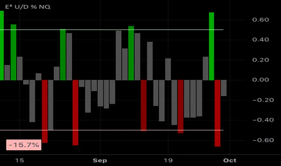
E³ Up-Down Volume % (NASDAQ)This lower indicator will show what % a day's total market volume on the NASDAQ COMPOSITE is bullish or bearish. It shows a history of every day's reading on a lower indicator pane.
Strong readings correspond to strong days and the differential in volume can often be ascertained from the market open and in the first 5-30 minutes of the market, to give you a sense of how the market might play out that day.
It is especially good at predicting STRONGEST days as well as DOJI days (indecision days).
EXAMPLES:
A +1% reading would mean that there is 1% more up volume on the day than down volume, meaning it's nearly a DOJI day or indecisive day where up down volume is basically 50/50 and the day is not particularly bullish (or bearish). Same goes for a very low bearish reading such as -1%.
an 80% BULLISH reading would mean that the day's volume differential is hugely favoring the bullside (buying demand). These days are so strong in sentiment that they usually end up being STRONG BULLISH CONTINUATION candles with little to no topside wick by the end of the day.
Conversely an 80% bearish candle would mean an intensely strong sell-side volume day.
TECHNICALLY:
90% bullish = 95% of the volume on the day is UP (very rare, ie: once every 2+ years)
80% bullish = 90% of the volume is UP (rare, ie: once or twice a year)
50% bullish = 75% of volume is UP (significant when it occurs, but not uncommon)
0-1% bullish = 50% of volume is up
-50% bearish = 75% of the volume is DOWN
-80% bearish = 90% of the volume is DOWN
-90% bearish = 95% of the volume is DOWN
OPTIMUM SETTINGS = Threshold Percent to 45-55%
This means that roughly 3/4 of the volume transpiring(ed) on the day is either UP or DOWN and will color the histogram if levels are that strong (either bullish or bearish)
Lowry Up/Down % VolumeShows the Up/Down volume %.
Carefully picked the color scheme of the bars so it's easy to see 80%/90% up/down days.
Added marks to highlight the 80/90% up/down days.

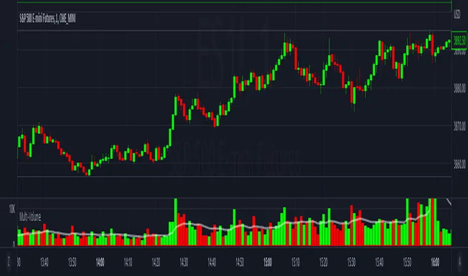
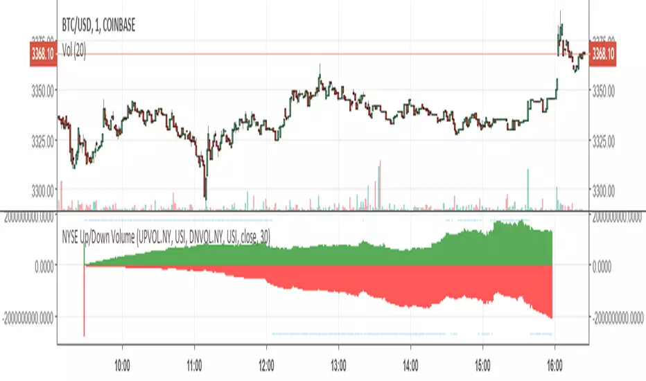
Multi-VolumeThis indicator displays volume in several formats:
Volume Bar Format:
Normal Volume: Shows the normal volume bar colors based on each candle's price direction
Up/Down Volume: Breaks down each volume bar into buying volume (volume added when price goes up) and selling volume (volume added when price goes down)
Volume Pressure: Breaks down each volume bar based on the length of the candle and its "pressure wick". See below for more information.
Flip Down Volume:
The down volume bar will be displayed below the center line.
Show Delta:
When selected with "Up/Down Volume" or "Volume Pressure", a small line will be displayed at the net volume (difference between up and down volume).
Projected Volume:
Instead of current volume, it will show expected volume at end of candle based on volume per second.
Volume Pressure:
On a green candle:
The red part represents the upper wick, the volume as the price comes back down from its high
The green part represents the rest of the candle, the volume as the price goes up from its low to the close
On a red candle:
The green part represents the lower wick, the volume as the price comes back up from its low
The red part represents the rest of the candle, the volume as the price goes down from its high to the close
To Update to Latest Version:
To update to the latest version, just close the indicator and add it again.
Improved Lowry Up-Down Volume + Stocks Indicatordocs.cmtassociation.org
In Paul F. Desmond's award winning paper in 2002 entitled "Identifying Bear Market Bottoms and New Bull Markets", he proposed an indicator for panic buying and selling that can be used to determine major market bottoms.
The paper explains that in major bear markets, you should have at least one, or more than one multiple 90% down days. Recoveries out of bear markets, or beginnings of new bull markets, should have at least one of the following conditions:
1) At least one 90% up volume day
2) At least two back-to-back 80% up volume days
Up and Down volume are defined as:
1) 90% up volume - defined as 90% up volume / total volume (or 10% down volume / total volume)
2) 90% down volume - defined as 90% down volume / total volume (or 10% up volume / total volume)
Several scripts exist in Tradingview to show this indicator for Up and Down volume, along with arrows or indicators for green up days or red down days.
However, this script is an improved version as it allows you the option to customize a couple parameters:
1) You may chose whether you'd like to use volume or stocks - sometimes it's better to have confluence between volume and actual stocks at the 90% threshold
2) You may chose the exchanges to consider - in the paper the NYSE is discussed, but this allows the expansion into NYSE, NASDAQ, DOW, and even a combined NYSE + NASDAQ + DOW indicator
3) It uniquely codes in the ability to plot a buy signal for both 90% up days, but also two back-to-back 80% up days - which is in the spirit of the original paper
I hope you enjoy this script and please let me know if you'd like me to make any modifications or additions.
Thank you, sincerely,
Jim Bosse

Consecutive Up/Down Bar LabelsMean reversion likelihood tends to increase with number of consecutive up/down days. This indicator plots a signal when the number of consecutive up/down days exceeds 3, in increasingly bright colors.

EMA50/200 — Nth Close After Break (Up/Down/Both)This indicator tracks EMA-based momentum confirmation using a customizable N-bar rule.
🧠 Logic:
- You can choose whether to track EMA 50 or EMA 200.
- When the price breaks above (or below) the selected EMA, the indicator starts counting.
- If the price stays on that side of the EMA for N consecutive closes, a single signal is triggered on the Nth bar.
- After signaling, the counter resets — the next signal appears only after a new EMA break.
⚙️ Parameters:
- Target EMA: Choose which EMA (50 or 200) the logic is based on.
- N: Number of consecutive bars required after a break.
- Direction: Up / Down / Both.
- Optional trend filters: Require EMA50 > EMA200 for Up signals, or EMA50 < EMA200 for Down signals.
- Blue ▲ = Bullish signal (Nth close after breaking above EMA)
- Red ▼ = Bearish signal (Nth close after breaking below EMA)
✅ Ideal for identifying strong trend confirmations and filtering out false EMA breakouts.

NYSE FOMO Indicator (Up/Down Volume Ratio)This script plots the NYSE Sentiment Gauge, based on the daily Up/Down Volume Ratio (UVOL ÷ DVOL).
It measures crowd emotion in the overall market:
• ≥ 3 = Red: FOMO, extreme buying.
• 2–3 = Yellow: Cautious optimism.
• 0.5–2 = Grey: Neutral zone.
• 0.33–0.5 = Green: Emerging fear.
• ≤ 0.33 = Bright Green: Panic selling, potential bottom.
The line color and chart background change according to these zones, visually showing shifts in market sentiment.

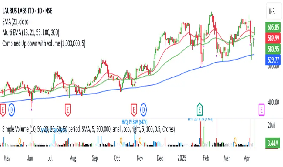
Combined Up down with volumeIndicator Description: "Combined Up/Down with Volume"
This Pine Script indicator combines price momentum and volume spikes to identify potential trend reversals or breakouts. It checks two key conditions:
Price Movement – A minimum percentage change (% check) in closing price.
Volume Spike – Trading volume exceeding a user-defined threshold (Volume above).
How It Works
1. Price Momentum Check
Calculates the 1-period Rate of Change (ROC) of the closing price.
Triggers when the absolute ROC ≥ % check (e.g., 5%).
2. Volume Spike Check
Compares current volume against a threshold (e.g., 1,000,000).
Triggers when volume exceeds this level.
3. Signal Plotting
If use = true:
Plots a purple circle below the bar when both conditions are met.
If use = false:
Plots a circle below the bar for price momentum alone.
Plots a circle (default position) for high volume alone.
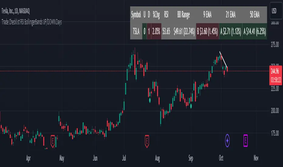
Trade Checklist RSI BollingerBands UP/DOWN DaysThis new indicator combines several key technical analysis components to provide traders with a clear, actionable view of market conditions. By integrating consecutive up/down days, RSI, Bollinger Bands, and multiple EMAs (9, 21, and 50), this tool helps identify potential entry and exit points with precision.
Consecutive Up/Down Days: Helps assess momentum by tracking how many days the stock has been moving in one direction, allowing traders to identify overextended trends.
RSI (Relative Strength Index): Provides insights into overbought and oversold conditions, allowing users to gauge the strength of price movements.
Bollinger Bands: Offers a view of volatility, with the proximity of the price to the upper or lower bands signaling potential breakout or reversal opportunities.
9, 21, and 50 EMAs: These EMAs work together to show short, medium, and longer-term trend dynamics. By tracking how far the price is from each EMA in both dollar and percentage terms, traders can easily spot trends, pullbacks, and mean reversion opportunities.
Why This Combination? Each component serves a distinct role, and together they provide a fuller picture of market conditions. The EMAs offer trend direction and potential reversal points, while the RSI and Bollinger Bands assess volatility and momentum. This multi-layered approach allows traders to make informed decisions and avoid relying on any one technical factor, helping them spot high-probability trade setups, such as mean reversion opportunities.
This indicator streamlines technical analysis into one easy-to-read table, eliminating the need for cluttered charts, and enabling traders to quickly assess the market before taking a position.
Trend Strength Indicator --- Up/Down Bars %Logic
With the lookback period set to 20 (editable), the script loops over the last 20 bars starting from the current bar and counts the up days (Close > Open) and down days (Close < Open). Then it divides the up/down days by the total number of days to give the %. Color themed fib levels are also implemented in this indicator.
Find me on Twitter

Consecutive Up/Down with AlertsAdded alerts to TradingView's already existing strategy "Consecutive Up/Down"

MACD represent up/down by green/red bars. MACD modified macd line to histogram and show up/down momentum by use green and red color.

Stochastic RSI - MTF - Up/down colours - 4hr default - squattterStochastic RSI - MTF - Up/down colours - 4hr (240) default
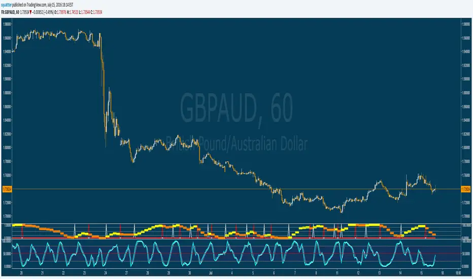
Fisher Transform with Up/Down colours - squattterCredit to HPotter - colour code borrowed from his AO script.

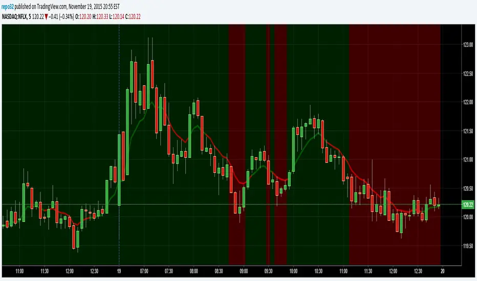
Background Up or DownThis script will color the background based upon whether it is positive or negative for the day. When looking at numerous charts, you can instantly see if they are up or down for the day. For me, I like to be going long on the stocks that are already moving up and short on the ones that are moving down. When using lower time frames, you can lose perspective of where it is on the daily chart.
On the example above, you can see a 5 minute chart of NFLX. It shows you when it dropped below the previous days close.
Up/Down Volume with Normal DistributionThis indicator analyzes the relationship between price movements and trading volume by distinguishing between "up" and "down" volume. Up volume refers to trading volume occurring during price increases, while down volume refers to trading volume during price decreases. The indicator calculates the mean and standard deviation for both up and down volume over a specified length. This statistical approach enables traders to visualize volume deviations from the average, highlighting potential market anomalies that could signal trading opportunities.
Relationship Between Price and Volume
Volume is a critical metric in technical analysis, often considered a leading indicator of price movements. According to studies in financial economics, significant price changes accompanied by high volume tend to indicate strong market conviction (Wyart et al., 2008). Conversely, price changes on low volume may suggest a lack of interest or conviction, making those moves less reliable.
The relationship between price and volume can be summarized as follows:
Confirmation of Trends: High volume accompanying a price increase often confirms an upward trend. Similarly, high volume during price declines indicates bearish sentiment.
Reversals and Exhaustion: Decreases in volume during price increases may suggest a potential reversal or exhaustion of buying pressure, while increased volume during declines can indicate capitulation.
Breakouts: Price movements that break through significant resistance or support levels accompanied by high volume are typically more significant and suggest stronger follow-through in the new direction.
Developing a Trading Strategy
Traders can leverage the insights gained from this relationship to formulate a trading strategy based on volume analysis:
Entry Signals: Traders can enter long positions when the up volume significantly exceeds the mean by a predefined number of standard deviations. This situation indicates strong buying interest. Conversely, short positions can be initiated when down volume exceeds the mean by a specified standard deviation.
Exit Signals: Exiting positions can be based on changes in volume patterns. If the volume starts to decrease significantly after a price increase, this may signal a potential reversal or the need to lock in profits.
Risk Management: Integrating volume analysis with other technical indicators, such as moving averages or RSI, can provide a more comprehensive risk management framework, enhancing the overall effectiveness of the strategy.
In conclusion, understanding the relationship between price and volume, alongside employing statistical measures like the mean and standard deviation, enables traders to create more robust trading strategies that capitalize on market movements.
References
Wyart, M., Bouchaud, J.-P., & Dacorogna, M. (2008). "Self-organized volatility in a complicated market." European Physical Journal B, 61(2), 195-203. doi:10.1140

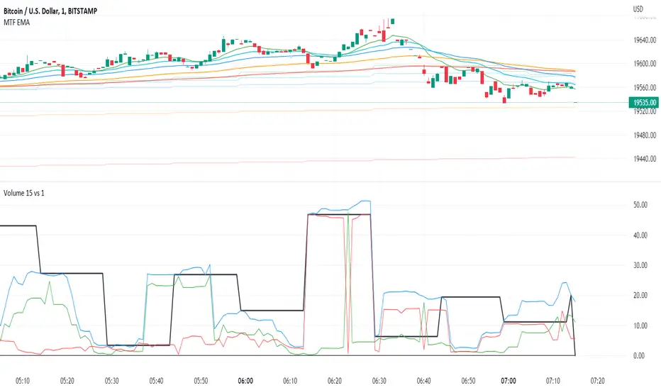
Volume 15m vs 1m*Up/Down Volume Indicator
This indicator plots the 15m volume (black line) on the 1m chart alongside the sum of 1m volume for 15m (blue line).
This indicator allows us to see the raw data that will generate the 15m volume before it occurs.
Next it seperates up period volume (green line) from down period volume (red line) so that we can see how much of each was responsible for the total volume.
The black line will dance for 15m at a time but if the blue line rises above the locked in section of the black line (to the left), then the next 15m volume will be higher than the last.
Also, if the green line is higher than the red, we know that up volume is driving of the increase.
*Volume Sum Indicator
This indicator allows us to track the volume trend even when volume is near zero.
This indicators sums the 15m volume for 13 periods to represent 200 minutes worth of volume.
Then it plots the sum of 1m up volume for 200 periods and the 1m down volume for 200 periods.
When green is over red, the volume is trending up.
Blue is the total 1m volume for 200 periods. It should act as a resistance line since it is unusual for 100% of volume to be up volume or down volume.
This indicator only works on the 1m chart. The higher timeframe must be set to 15m. If anyone knows how to make this indicator work on any timeframe that would be great!